Exploratives Design 2 – Projekt Blindenstock

Im zweiten Teil der Lehrveranstaltung sollen Personen mit Einschränkungen unterstützt werden. Dabei liegt der Fokus nicht auf der Aufhebung einer Schwäche, sondern in der Förderung einer daraus resultierenden Stärke. In unserem Fall ist dies die Verbesserung des Blindenstocks, da dieser zu einem noch hilfreicheren Mittel werden kann und damit sogar Vorteile entstehen können, die ein Sehender auch verwenden möchte.

Wir möchten die Indoor-Navigation verbessern, da dies für blinde Personen ein besonderes Problem darstellt, aber auch für Sehende immer wieder zu Problemen führt.

Wir haben mit der Firma Insidernavigation Kontakt aufgenommen. Mit deren Technologie wäre es möglich, Raumpläne zu hinterlegen und per Handykamera markante Punkte wieder zu erkennen um eine Navigation zu ermöglichen. Auch wenn deren Technologie noch nicht völlig für unser Projekt ausreichend ist, so können wir davon ausgehen, dass es in den nächsten 10 Jahren eine Möglichkeit gibt, die Navigation deutlich zu verbessern.

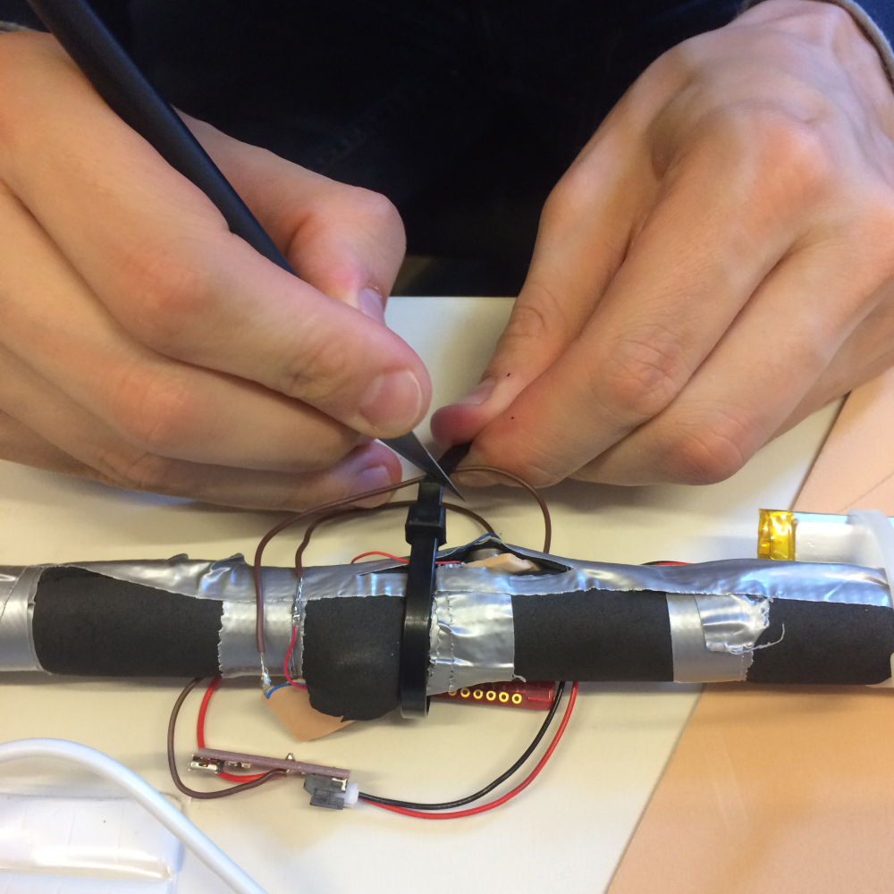
Aufgrund dieser Erkenntnisse haben wir uns nun Gedanken gemacht, wie wir einen Blindenstock so verändern können, damit das Feedback für die Navigation direkt am Stock ausgegeben wird. Der derzeitige Prototyp (Stand 1.06.2016) ist mit 2 Vibrationsmotoren ausgestattet um die Person an den gewünschten Ort zu navigieren, ohne dabei andere Sinne als den Tastsinn zu belegen.

Alle Entwicklungsschritte des Projektes finden Sie hier:
https://larissaexd.wordpress.com/category/exde_2-new-year-new-possibilities/

prototyp2 prototyp1

Finales Projekt

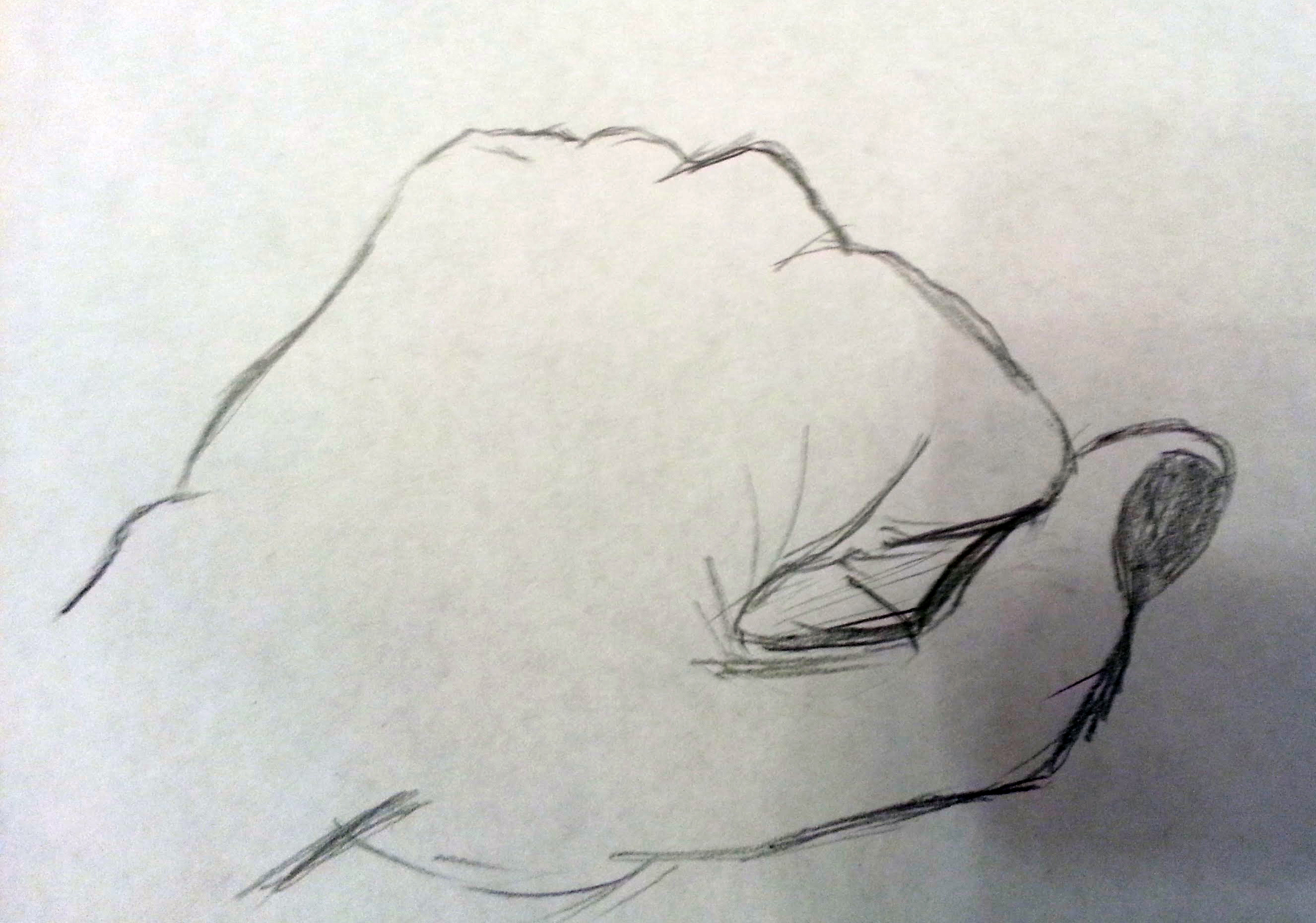
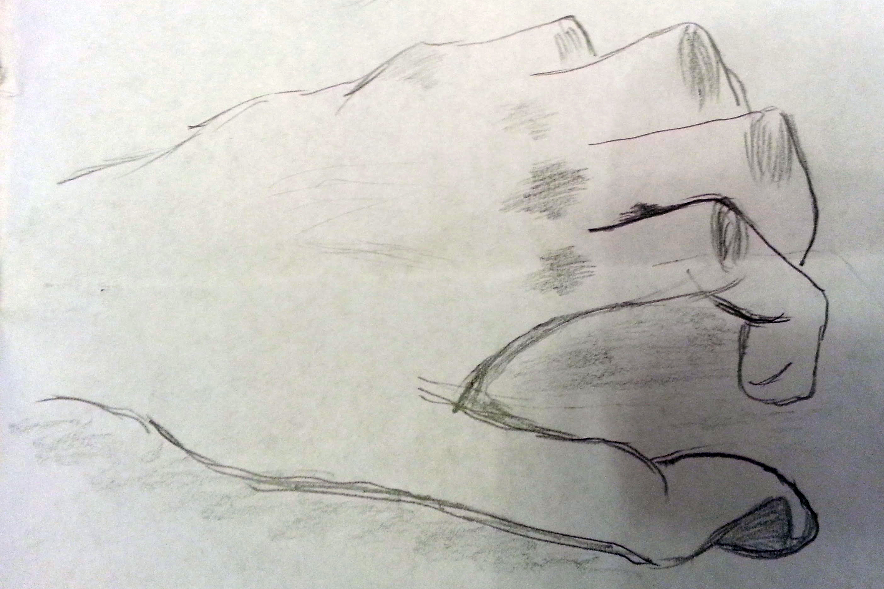
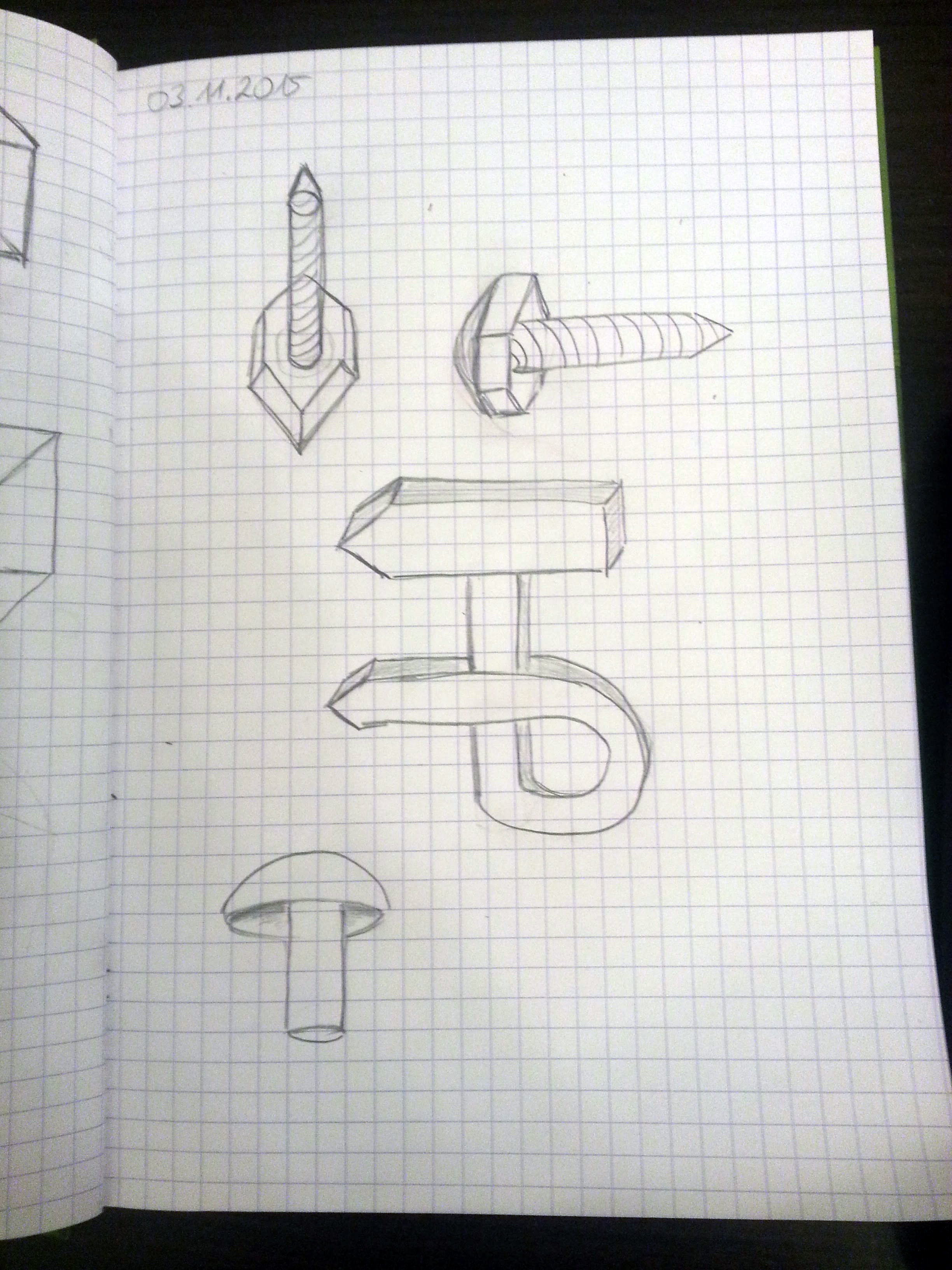
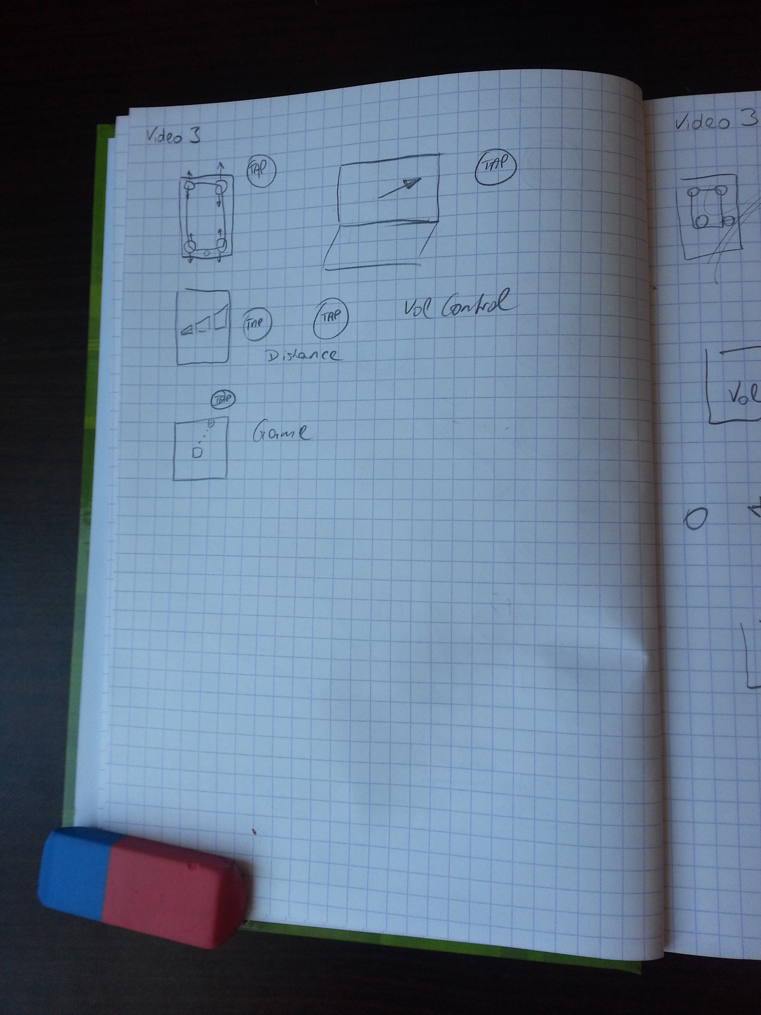
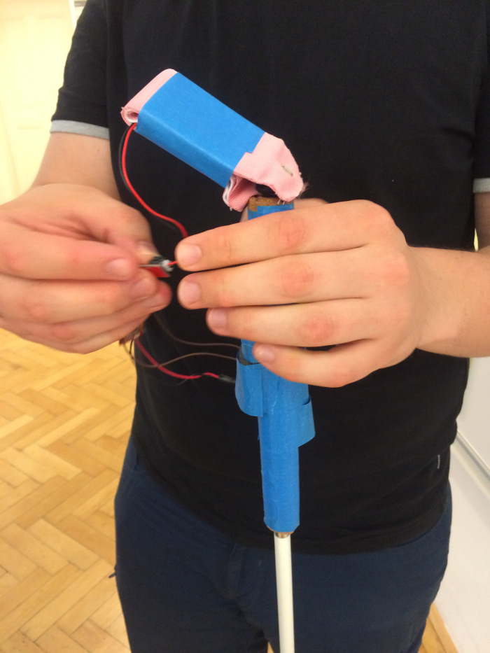
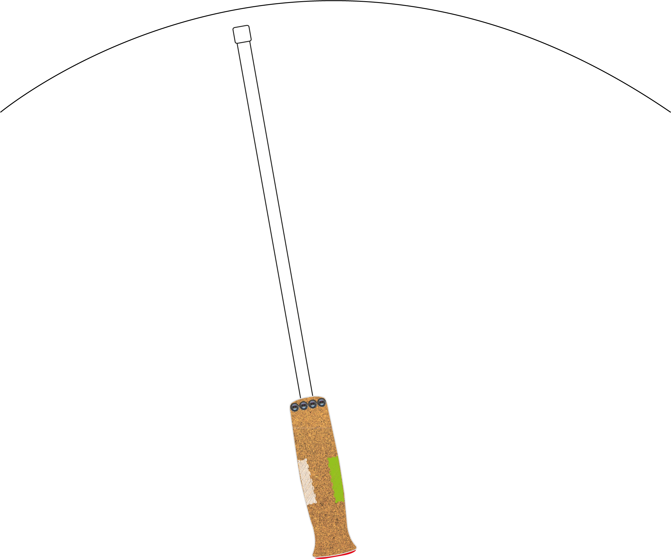
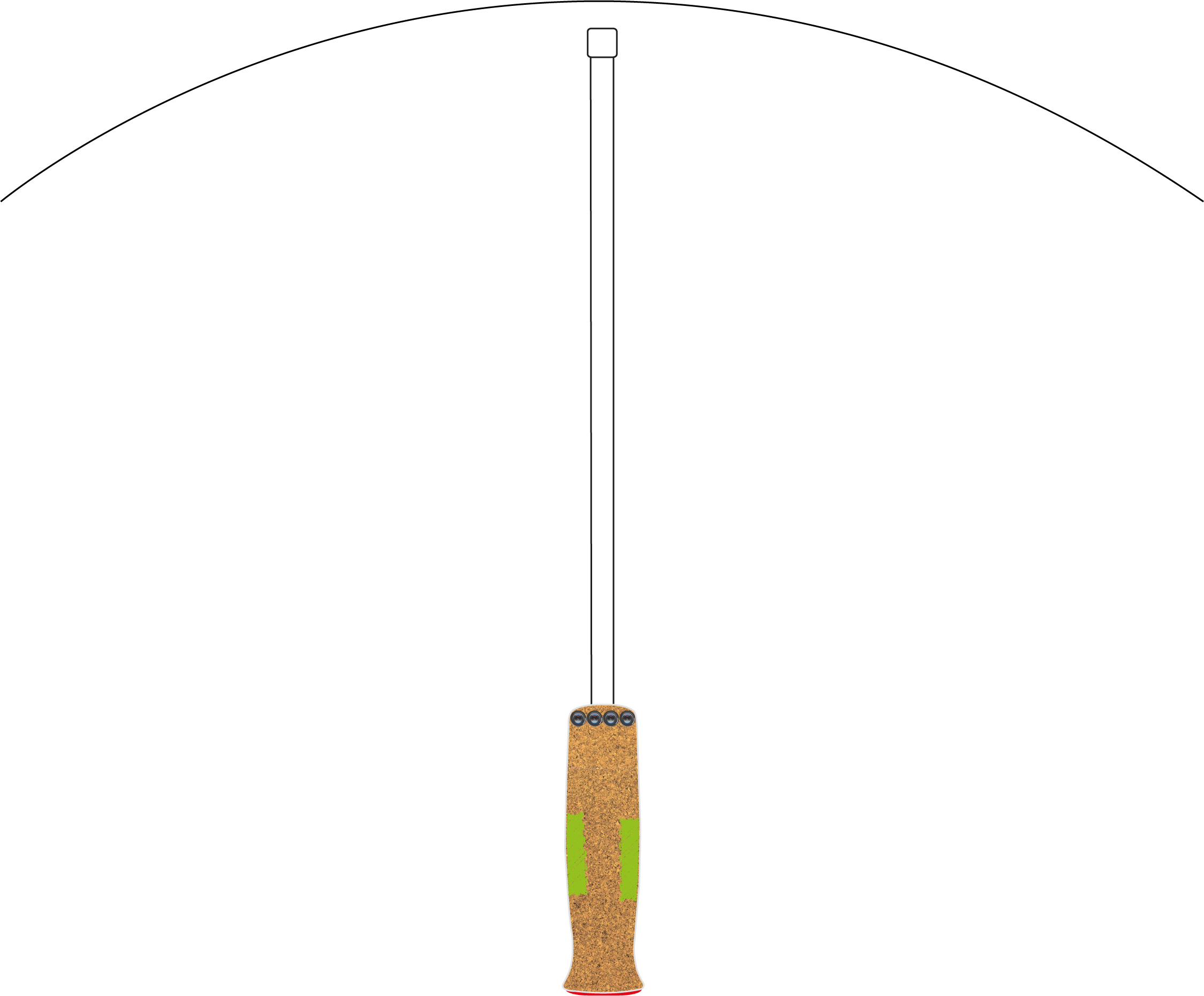
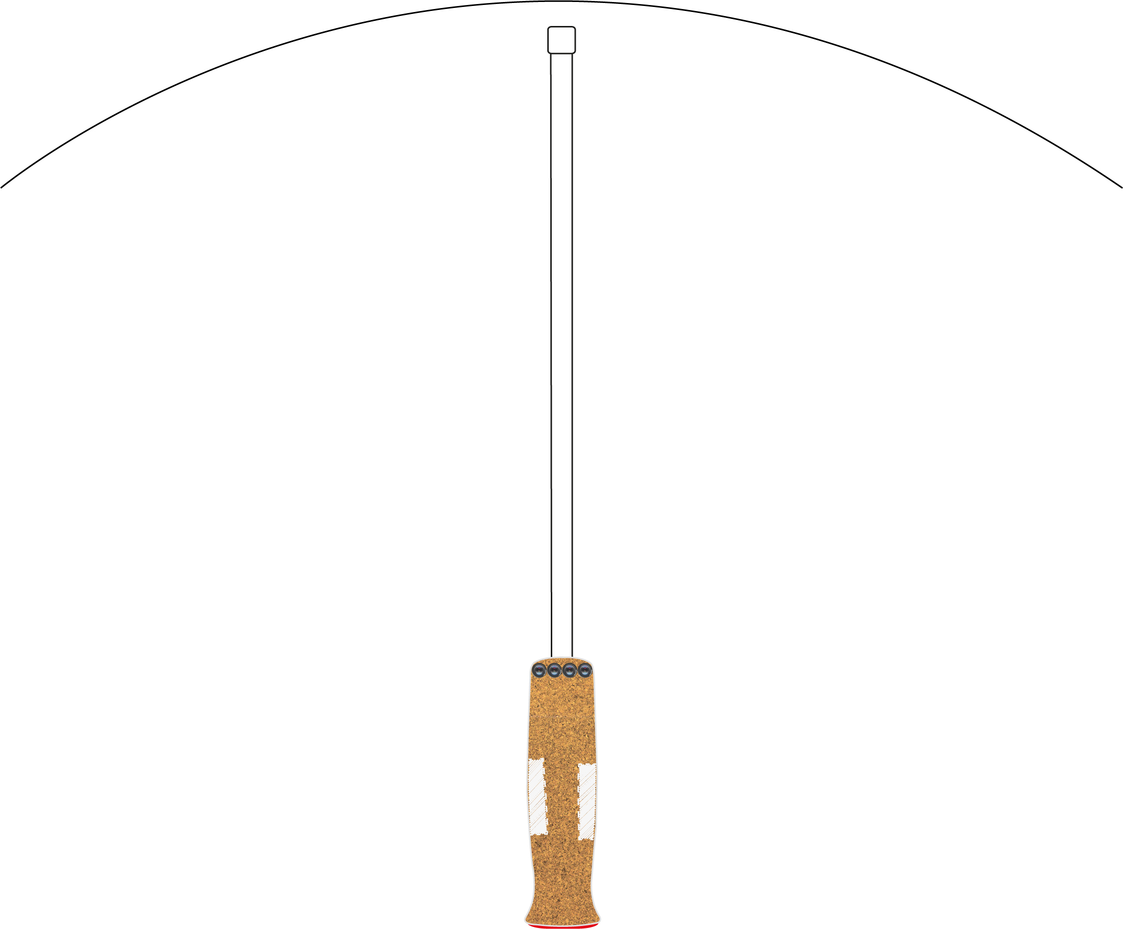
Prototyp des Griffes:

Griff des Blindenstockes mit integriertem Vibrationsfeedback

Griff des Blindenstockes mit integriertem Vibrationsfeedback

Interaktionsmodell:

  1. Eingabe erfolgt ueber Smartphone: Tippen oder Sprechen
  2. Einschalten/Ausschalten Stock ueber versenkbaren Knopf am Stockanfang, zweifache Vibration des gesamten Stockes, um zu zeigen, dass Stock jetzt an/gleich aus ist (wie bei iPhone)
  3. Sobald die Eingabe erfolgt, kann das Smartphone weggesteckt werden (Hosentasche), App laeuft im Hintergrund
  4. Interaktion über den Blindenstock:
1. Richtungswechsel wird durch Vibration auf der rechten Seite signalisiert

1. Richtungswechsel wird durch Vibration auf der rechten Seite signalisiert

2. Stock wird in die Richtung bewegt, solange die Vibration anhält

2. Stock wird in die Richtung bewegt, solange die Vibration anhält

3. Korrekte Richtung gefunden, beide Seiten vibrieren

3. Korrekte Richtung gefunden, beide Seiten vibrieren

4. Vibration stoppt nach 1.5 Sekunden

4. Vibration stoppt nach 1.5 Sekunden

Über den roten Knopf auf der Rückseite kann

  • bei langem Druck die Funktion ein- und ausgeschalten werden
  • bei kurzem Druck nachgefragt werden, ob die Richtung nach wie vor stimmt und sich vergewissern, dass die Navigation noch stattfindet.

Abschlusspräsentation:

https://docs.google.com/presentation/d/1hr0G2ZLEWAUMcZBdaCb-VAB-rEAEIkT7qK74-fUU2t8/edit?usp=sharing

Product Packages

Task:

12.11 – 3 möglichst verschiedene produktverpackungen pro kategorie. kategorie anmelden, im pad maintainen. eventuell fotos, aber besser mitbringen.
i
m blog diskutieren nach folgenden gestaltungsmerkmalen: typographie, farben, form(en), grid, gestaltgesetze, zielgruppe,  »allfälliges«. 

Implementation:

1. DeBeukelaer – Creamy Cookies

de_beukelaer

  • Typographie: Die Überschrift besteht aus einer dynamischen Schreibschrift (ähnlich des Herstellernamens), die Produktbezeichnung jedoch aus einer Blockschrift. Es wirkt optisch sehr stimmig.
  • Farben: Dezentere Hintergrundfarben, im Vordergrund eher Text und und das Bild der Cookies. Blau-,Rot-, Grün- und Brauntöne
  • Form(en): eckige Schachtel, recht groß und auffällig
  • Grid: Auf der Vorderseite der Schachtel ist das Muster ‚augedruckt‘ (spürbar), damit hebt es sich optisch und haptisch von der Schachtel ab.
  • Gestaltgesetze: Sehr geradliniges Design, Überschriften klar erkennbar, man weiß sofort was zusammengehört
  • Zielgruppe: ab Jugendliche, für (Klein-)Kinder wirkt die Schachtel zu erwachsen.

2. Milka – Choco Cookies

milka

  • Typographie: Die Überschrift besteht aus einer dynamischen Schreibschrift, die zweite Überschrift wieder aus einer serifenlosen Schriftart. Der Unterschied besteht hier eher darin, dass der Fokus eher auf dem Hersteller als auf dem Produkt ist.
  • Farben: Milka-typisches knalliges Violett mit weißer Schrift. Hoher Wiedererkennungswert.
  • Form(en): Verpackung aus Plastik/Alu. Die Verpackung verfügt über einen ‚Zip‘, um die Verpackung schnell öffnen und wieder verschließen zu können. Funktioniert meiner Erfahrung nach aber selten, da die Verpackung geschlossen bleibt und nur die Folie darüber abgezogen wird. Verpackung ist „liegend“.
  • Grid – nichts besonderes
  • Gestaltgesetze: –
  • Zielgruppe: verspielter als DeBeukelaer, daher eher Kinder/Jugendliche

3. Bahlsen – Mini Cookies Chocolate Chips

bahlsen

  • Typographie: Bahlsen in Schreibschrift, die Überschrift in serifenloser Blockschrift, und die dritte Zeile und Groß/Kleinbuchstaben. Vom Aufbau daher gleich mit de DeBeukelaer.
  • Farben: Blau, Rot, Braun
  • Form(en): stehende Verpackung aus Plastik/Alu. Eine sinnvollere Verpackung als die vorhergehenden, da die Kekse darin liegen und am wenigsten Platz verbrauchen, daher auch die kleinste Verpackung (und auch die, die man wahrscheinlich am ehesten übersieht)
  • Grid: nichts besonderes
  • Gestaltgesetze: Schriften nah beieinander. Wieder ähnlicher Aufbau wie bei den Produkten zuvor: Zuerst die Texte, welche als zusammengehörig zu erkennen sind, darunter das Produktbild.
  • Zielgruppe: Jugendliche/Erwachsene, nicht so verspielt und knallig wie das Milka-Produkt.

The Daily Hand Sketch/Photo

Task:

*** fotos weitermachen. jeden tag eine hand skizzieren bzw. irgendwas mit hand fotografieren

Implementation:

13.11.

13.11.

16.11.

16.11.

17.11.

17.11.

18.11.

18.11.


19.11.

19.11.

20.11.

20.11.

20.11.

23.11.

23.11.

24.11.

25.11.

25.11.


Hybrid Sketch

Task:

11.11 – entwerfen sie zwei funktionen, die erst durch den touchscreen, den sie gestern in ein gerät eingebaut haben, möglich werden. machen sie ein foto von der bedienungseinheit des geräts, und verwenden sie die technik der »hybrid sketches« von pp127-132.

Implementation:

My coffee machine

My coffee machine

Above you can see my coffee machine, which has three buttons for Power, „make coffee“ and steam, as well as a wheel for the amount of water. The wheel for the amount of coffee beans is directly in the coffee bean reservoir on the top right.

Hybrid sketch - water amount slider

Hybrid sketch – water amount slider

The first function shows how to control the amount of water (water, because the right Button labeled with „W“ is selected). It’s a digital slider, therefore the user can wipe on the control to select the amount. The Buttons „+“ and „-“ add/reduce 75ml of water. If the „K“ ( for „Kaffee“ 😉 ) is selected, the amount of coffee can be selected in the same way. The amount is visible on the digital display. By holding the GO-Button for 2 seconds, the coffee will be prepared.

Hybrid sketch - quick menu

Hybrid sketch – quick menu

The second function shows a quicker way to choose the coffee type, which is easier and faster (but the amount of water and coffee is predefined).

Reflection:

I haven’t heard of „hybrid sketching“ before, so this was completely new to me. An interesting way to design an interface. Using a picture makes the design seem more alive and the user as well as the designer can better understand how well the implementation will work.

Screen Sketch

Task:

10.11 – wählen sie die bedieungseinheit eines küchengeräts (herd, kühlschrank, geschirrspüler, etc) oder feuchtraumgeräts (waschmaschine, trockner, schleuder, etc) und stellen sie sich vor, statt der vorhandenen regler, knöpfe und anzeigen wäre dort ein touchscreen eingebaut (die maße stehen ihnen frei). wie würde das interface dann aussehen? skizzieren sie nach den prinzipien von p91-94 zwei screens dieses interfaces und beschreiben sie, wie die interaktion dort vor sich geht. beschränken sie sich dabei auf die abbildung der vorhandenen funktionen des geräts.

Implementation:

touchScreen1

The first screen shows a touchscreen conrolling my coffee machine. The idea is all important tasks are immediately accessible. The top center is a digital display which shows the current status and gives additional in information.

touchScreen2

The second screen shows options from a menu.

Reflection:

Screen design is something that every student in media informatics should have done so far, therefore not much new in this lesson, although i can’t remember that i have ever designed a software for a touch display.

Sketching Vocabulary – Faces and Emotions

Task:

9.11. – teile die seite im skizzenbuch in einen 5×3-raster und zeichne abwechselnd in jedes feld eine person, die etwas macht oder eine emotion ausdrückt, inkl. gesichtsausdruck! vgl. p87-89

Implementation:

Faces and Emotions

Faces and Emotions

Reflection:

That was fun! I felt that i do some kind of comic and could play around. It was sometiimes difficult to express the emotions i wanted to convey. „Extremely happy“ is the most difficult for me, because i can’t draw the eyes correctly.

The Daily Upside-Down Drawing

Task:

*** ab 4.11.: statt den geometrischen körpern täglich eine 10min upside-down zeichnung von einem bild.

Implementation:

4.11.

https://upload.wikimedia.org/wikipedia/en/c/c2/Peter_Griffin.png

Peter Griffin

Peter Griffin

5.11.

https://upload.wikimedia.org/wikipedia/en/a/aa/Bart_Simpson_200px.png

Bart Simpson

Bart Simpson

6.11.

http://www.freevector.com/site_media/preview_images/FreeVector-Stewie-Griffin.jpg

Stewie Griffin

Stewie Griffin

-weekend-

9.11.

Stan Smith

stan_sketch

10.11.

snoopy

snoopy and woodstock

snoopy and woodstock

11.11.

brian_griffin

The (thickly) Brian Griffin

The (thickly) Brian Griffin

Sketching Vocabulary – People

Task:

6.11. – fülle eine seite im skizzenbuch mit vielen kleinen menschen, die alle verschieden gezeichnet sind. vgl. p87

Implementation:

sketchingPeople

Reflection:

I recognized that i am really not skilled in drawing people 😀 This is definitely something i have to work on and improve because every designer should be able to draw emotions and stick-figures in different ways. Good exercise, that i will have to repeat to improve myself.

Sketching Vocabulary – Composing Objects

Task:

5.11. – mach auf eine seite im skizzenbuch einen 6×4 raster, und zeichne in jedes kästchen ein kleines, vereinfachtes objekt (vgl. p86) aus den bereichen sport oder kunst.

Implementation:

Sport Drawing

Sport Drawing

Reflection:

I had fun during the exercise, although i had to look up the internet to get some impressions and ideas. I think if i would do more of drawing and simplifying objects, i would improve significantly in that area.

Sketch what you see

Task:

4.11. – sketch what you see
führe die übung durch, die auf den seiten 75-82 beschrieben ist. poste das ergebnis.

Implementation:

Drawing a person from imagination

Drawing a person from imagination

Copy of "Sean's Afternoon"

Copy of „Sean’s Afternoon“

Upside-down in progress..

Upside-down in progress…

Upside down drawing finished

Upside down drawing finished

Reflection:

This was interesting, but veeeery time-consuming. It took me far over an hour for the drawings. The upside-down drawing technique turned out to be effective, but it also takes a lot of patience for every single line to be correct.

Taking your pencil for a walk

Task:

2.11. – taking your pencil for a walk. schau das folgende youtube-video: https://www.youtube.com/watch?v=ldq1QwaLAUE
mach dabei die in 3.1 beschriebene übung. poste das bild auf den blog. 
3.11. – schau dir 3 andere blog-einträge zu der »taking your pencil for a walk« übung an (die drei direkt unter deinem eintrag unten), und poste auf dem blog einen kurzen kommentar.

Implementation:

pencil_for_a_walk

i took the pencil for a walk

Blog-Comments: 


Starting the photo sampling

Task:

29.10 – bis seite 42 lesen. photo sampling aufsetzen und starten. ev. verwendung von flickr oder ähnlichem image sharing service, um die bilder auch unabhängig vom blog zu sammeln. eine methode finden, mit der auf dem blog neue bilder aus dem photo sampling (zb. in der sidebar) zu sehen sind.

Implementation:

I will use flickr, since it is integrated in wordpress and easy to use. I created a new flickr account and added a widget to this site. The widgets are a bit hidden, since they are not directly visible, but in the right menu. The screenshot below shows where you can find the images.

flickrImageDesc

Link: https://www.flickr.com/photos/135751717@N08/
RssFeed: https://api.flickr.com/services/feeds/photos_public.gne?id=135751717@N08&lang=de-de&format=rss_200

The Daily Sketch

Task:

*** ab 26.10. jeden tag: 10 min skizzen (wecker stellen) von einer art von geometrischem körper (würfel, kugel, pyramide, etc.) auf einem blatt des skizzenbuchs. können überlappen, aber nicht mehr als ein blatt! ein ansatz könnte sein: möglichst viele verschiedene arten, den körper darzustellen. brich die regeln!

Implementation:

sketch_20151026

26.10.2015

sketch_20151027

27.10.2015

28.10.2015

28.10.2015

29.10.2015

29.10.2015

30.10.2015

30.10.2015

02.11.2015

02.11.2015

03.11.2015

03.11.2015

sketching: smartphone app adaption

Task:

28.10 – bis seite 34 lesen. führe methode 1-3 an einer (ungewöhnlichen) smart phone software durch, die du öfters mal verwendest.
method 1 – min 4 sketches von demselben screen
method 2 – min 2 sketches von verschiedenen videos
method 3 – 1 sketch von einem anderen video.
Methods:
Method 1
Open up an application of your choice on your computer. Giving yourself 30 seconds or less, try to capture the essence of an idea as a scribble sketch. Then repeat this, where you create new scribble sketches that capture different ideas in an application. Now try this again with different – perhaps unfamiliar – applications.
Method 2
Search YouTube or other sites for videos of innovative interfaces. As you are watching them, scribble sketch as many ideas that capture your interest without pausing the video. This will force you to sketch very quickly, i.e., as soon as you see an idea.
Method 3
Redo Method 2, but this time don’t look at your drawing while you are sketching. The trick is not to move your hand around that much while scribbling, otherwise your lines will not be in the right place. It takes a bit of practice, but you will be surprised how recognizable things are, at least to you.

Implementation:

Sketches using method 1 on the app: theScore Esports

Link: https://play.google.com/store/apps/details?id=com.thescore.esports&hl=de

theScore Esports is an android app showing eSports Data (game stats, etc.). My approach was to first sketch the Layout, then have the focus on menu and then on Content. Finally i tried to draw an abstract layout, trying just to remember what controls are at which positions.

theScoreScreenshot

Screenshot of the app

theScore-sketch

Sketches with detail to Layout, Menu, Content and an abstract layout schema

[4 Sketches and explanation]

Sketches using method 2 on the youtube video
Samsung Gear S2 user interface – Hands on at IFA 2015

sketch_video1

The first video explains the input methods of the samsung gear s2 smartwatch. A wheel on the left side controls the switching of apps, windows, etc.

Sketches using method 2 on the youtube video
Expanding the Input Expressivity of Smartwatches with Mechanical Pan, Twist, Tilt, and Click

sketch_video2

The second video is about a watch, that has several input methods. By panning, twisting, tilting and clicking the user can perform multiple inputs at once.

Sketches using method 3 on the yotube video
Toffee: Enabling Ad Hoc, Around-Device Interaction with Acoustic Time-of-Arrival Correlation

The third video was difficult to sketch without looking. It’s about a system, that is able to recognize from which direction sound is incoming. Because it’s always about a smartphone/tablet/pc and a user tapping somewhere else to make sound, it was difficult to keep relation between these two. The last sketch on the bottom of the paper should demonstrate a game, where the center shoots at enemies and the direction is controlled by tapping in the correct direction. Since i was completely off the shooting line when drawing the tap, the sketch doesn’t make much sense.

sketch_video3_withoutLooking

sketching without looking

I also tried the same video with looking at the paper. The result is much better.

sketch_video3_withLooking

another try with looking on the paper

Reflection 28.10.2015

Drawing without being able to look at what i am drawing is difficult. At my stage of skill, i would always go over the sketches when i have the time afterwards. Otherwise i would not expect them to make much sense to me when looking at them one week later. Comparing it to the second try (with looking), i think i will know what the idea was in the video.

sketching: smart phone touch screen

Task:

26.10 – stell dir vor, du hast einen smart phone touch screen, der spürt, wie fest du drückst. was könnte man mit so einem touch screen besser machen als es jetzt gemacht wird? dokumentiere 7 ideen, was man damit anders machen könnte, und dann nimm eine dieser ideen und kreiere 7 variationen. (eh klar: nicht erlaubt ist es, sich anzuschauen, was es dazu jetzt schon gibt!)

Implementation:

The first thing that comes to my mind is to select different states of one option. This could be to set a slider bar accordingly to the input pressure.

Another idea is to improve existing apps ( i am an android user btw 😉 ). Starting with the home applications, including a quick-access feature would help to speed up find favorite apps. This feature should be modified be the user (choosing the app, set pressure and duration to start the behaviour).
An app that would benefit from pessure input would be Google Maps. The user could Zoom directly without any slider or gestures and just with one finger. The camera app can be improved by selecting different states while triggering a photo: the pressure could be used to pre-focus, taking a photo with or without flash, zooming in/out can be used with another finger.
And a feature that will enhance any keyboard app is switching between upper and lower case letters (pressing harder for upper case letters).

Creating new apps relying on the feature of pressure is interesting and challenging. Assuming that the display is heavy weight resistent and very distinctive, the first app would be „Scales“ – an app for measuring weight.

Games can also be enhanced using the feature. A racing game could use pressure to acc/decelerate the vehicle. Even the breaks could be controlled with that sensitivity feature. A plattformer would even more benefit. The speed of the game character could be directly controlled pressing a (virtual) left or right button, the height of the jump would be set by pressure too. Beat’em up games would use the feature to select the punch/kick (light, medium, hard) or any other action.
It could also be used to raise the difficulty level, like QWOP (https://de.wikipedia.org/wiki/QWOP, a game that has it’s challenge in mastering the controls).
Another game that relies solely on the input feature is an adoption of guitar hero, but the goal is the following: a 2-dimensional coordinate system, in which a point is shown (e.g. x=sound volume, y=pitch) and the user has to control two pressure buttons (controlled with thumbs) and the better the point is approached, the more correct the sound plays.

The last idea is to introduce the function as a system wide „right click“ in the android world. Whereever there are options that can be offered to the user, he/she will access the context menu be tapping on the control (e.g. button, text field etc.) and push a bit more to show the context menu.

Summed up, the five features are:

  • Input feature: Slider (choose one option out of severals)
  • Improving existing apps: Home App, Google Maps, Keyboard
  • Creating new apps: Scales
  • Improving games: jump’n’runs, racing games, beat’em ups,…
  • Input feature: Context Menu

7 Variations of the feature Slider:

  1. Volume Control
  2. Zooming
  3. Brightness Control
  4. Display Timout
  5. Brightness of Flashlight
  6. Choosing between different profiles
  7. Switching between display options (list, tiles, etc.)

Reflection 26.10.2015

It was difficult to come up with completely new ideas. I tried to find ideas that are different from each other which is not easy at all.


Task:

27.10 – nimm eine andere idee und kreiere 7 variationen.

Implementation: 

7 Variations of a jump’n’run game:

  1. Speed – from sprinting to creeping (yep, there are stealth missions)
  2. Height of jump
  3. Shooting: fire rate (higher fire rate kills enemy faster, but reduces ammunition faster)
  4. Jumping and stomp down: a jump that will break the floor on landing. Stomping forward will break walls.
  5. Shooting: Bullets depending on pressure: high pressure for rockets (for heavy enemies), pressing slightly toggles bullets (for fast enemies)
  6. Higher pressure for moving objects faster (or heavy objects at all), but slight objects are pushed away, which can attract enemies
  7. A button spins the character – higher pressure results in spinning faster

Reflection 27.10.2015

Finding ideas for a jump’n’run game was fun and not as difficult as the challenge from yesterday. Finding ideas for games was easier for me than finding input options for apps (respectively result of that input).

Starting to sketch

Sketchbook

sketchbook_cover

Sketchbook – Cover

The first decision i hade to make is which cover i prefer. I bought a book with a hard cover because i thought it would be easier to draw outside due to the solid background.

The second decision was the size – A5 is in my oppinion to take it with me, but is also big enough for sketches.

The third decision was the page layout/background. The graph paper will hopefully help me with my drawings, since i’m not a good drawer and that’s why i decided against plain paper.

Sketchbook with graph paper

Sketchbook with graph paper

Design Theory: Design Science

Design Science

Design Science is a Design Theory introduced by R. Buckminster Fuller in 1963. During my research i collected some quotes describing what Design Science means, which i present to you in the following pararaphs:

…design was not a science and … design science referred to the scientific study of design

– Wikipedia

… distinction between scientific method and design method

– Wikipedia

For example, when humans have a vital need to cross the roaring rapids of a river, as a design scientist I would design them a bridge, causing them, I am sure, to abandon spontaneously and forever the risking of their lives by trying to swim to the other shore.“

– R. Buckminster Fuller, from Cosmography

Design Science is a problem solving approach which entails a rigorous, systematic study of the deliberate ordering of the components in our Universe. Fuller believed that this study needs to be comprehensive in order to gain a global perspective when pursuing solutions to problems humanity is facing.

– https://bfi.org/design-science

Design science is the design and investigation of artifacts in context

– Wieringa, R.J.

… a process of recognizing, defining, and solving problems, and of formulating a goal and the systematic path of reaching that goal.

… an integrative discipline wherein the findings of all sciences and humanities are brought to bear to solve humanity’s problems.

– Medard Gabel

According to An Introduction to Design Science by Paul Johannesson Design Science is about a practical problem (practical challenge) which can be be solved by „artefacts„. Artefacts are human made objects, which can be physical objects like a hammer but can also be in different forms , like an architect’s plan.

The function of an artefact desribes, what it can do to support the user in solving the practical problem (e.g. a clock shows the time).

The behaviour of an artefact describes the action to provide the function (clock spins three needles to show the time).

The structure describes the inner working (the clock consists of three needles, a battery and so on).

The environment describes the circumstances and the outer influences, at which the artefact has to operate.

To design an artefact which will solve the problem, all these variables have to be considered.


Back to: Design of Everyday things

What does Design science have to do with Signifiers, Affordances, Conceptual Models and System Images?

The signifiers give us information about the artefacts. Without signifiers, we wouldn’t know, for example, where the artefact is or how it is used. Taking the example from Buckminster Fuller, the bridge across the river, the Signifier tells us where the bridge is, the construction will signify that it will not break when crossing it, etc.

Keeping with the example, affordances invite us to use the bridge. What is the bridge good for when everyone is still trying to go through the river.

The conceptual model is the most difficult to connect with Design science. I would argue, that it’s not important to understand how the artefact works, as long as the artefact solves the problem (and the user knows how to apply the artefact).

System images are vital for design science, in my oppinion. The bridge, for example, is of no use if people don’t know how to pass it.

Looking back to my projects of Lesson 1 – 3, the box is a good example. I have chosen the design to achieve the three goals, not to impress or anything else – which is what design science is about. The problem was to solve the three challenges (rub, grab, turn) with three artefacts (duct tape, eyecatcher, arrows).

Lesson 3: Gulfs of evaluation & execution

3.1. Seven Questions to Cross the Gulfs

Seven Questions Goal World Execution
(Discovery)
Evaluation
(Feedback)
 What does it mean?  X
 What are my alternatives?  X
 What happened? X
 What do I want to accomplish?  X
 What can I do now?  X
 Is  this OK? Have i accomplished my goal? X
 How do I do It?  X


3.2. Reflection – gulf of evaluation or gulf of execution

gulfOfEvaluation

To light the hot plate the user has to push and hold the knob on the front, use a lighter to inflame the gas. Furthermore the user has to hold the knob, because the fire will go out as soon as the they release the button. So there is a gulf of execution (What are my alternatives, what can i do now).

The trick is that there is a temperature sensor which measures if the plate is hot enough to keep the fire T.he sensor is actually to shut down the gas if the fire goes out by itself or by accident to avoid gas toxication. So what happens is that it executes the trigger immediately when the plate (sensor) is not hot enough. Because there is no feedback when this threashold is reached, the user will either have to push the button long enough to be sure or has to do the trial-and-error approach. The lack of feedback could be easily fixed with a LED indicating whether the threashold is reached. So the stove is also an example for the „gulf of evaluation„.

Lesson 2: Conceptual Model & System Image

2.1. Chinese Puzzle Pot – How does it work?

puzzlePot

2.2. Find a good conceptual model

The process of football training

conceptualModel

2.3. Example of a good System Image

backpack

Backpacks, and especially zippers

Zippers are easy to use, the functionality is clear within a second, you can’t use it in the wrong way. The backpack is a product that relies on that functionality. No designer will be needed to explain how zippers or (traditional) backpacks work.

2.4. Conceptual Model of Home Heating System

The thermostat should be set to the desired temperature. Setting it higher is on the one hand strange because the system does not have information about the preferred temperature. On the other hand it involves a second operation of turning off the heating-operation when the desired heat is reached. A better solution would be an eco-heating-option, where the heat is reached without using too much energy. Otherwise the temperature will be reached as soon as possible.

2.5. Fix the faulty System Image for the Home Heating System

heatingSystem

2.6. Wrong System Image

remoteControl

This is my personal remote control and i find it very useful. But it represents also a good example for a wrong system image. The control is not self-explanatory, the functions are often hidden. To execute specific functions, buttons have to be pressed in order. The program the control, a software must be downloaded and used, which has to be known. Most people will at least have to throw a glance at the manual.

2.7. Project 2 – Build a box

box1

The box has a Donkey on it as an eyecatcher. The question mark combined with the direction markers indicate that the user will find something following the arrows. The adhesive tape holds the box closed and the starting point of the tape is again glued with duct tape and glue (so the top can’t be pulled of and the user has to follow the arrows).

  • Grab it: Eyecatcher, Question mark
  • Rub it: tapes. Duct tape
  • Turn it: Arrows

The bottom tape can easily be pulled of and the box can be opened.

box2

2.8. Project 2 – Evaluation

  • Stop to look at it? YES
  • Grab it? YES
  • Pick it up? YES
  • Turn it? YES
  • Rub it? YES

I would improve the eyecatcher. It worked because i put it in our flat, where something unusual is soon realized. If i would put it outside, i think noone will grab it. Next time i would make it look more like a present or put flashing lights on it. The feedback also stated that the orange-red color of the box helped that the box was instantly recognized. Otherwise i wouldn’t change much because it worked really well. The downside was that the user’s interest was soon gone, because the users opened the box fast and from then on the box didn’t offer anything else.

Lesson 1: Affordances and Signifiers

1.1. Understandable and Confusing Design

  • Understandable Design – Gamepad

The form of the gamepad and the orientation of text signify how to hold the gamepad. The usage of the buttons can be easily figured out (can be pushed, are labeled, have different color). Affordance is conveyed through buttons (pressing) and sticks (can be moved). The digital trigger have different feedback then the analog trigger, which indicate the difference of two (similar) triggers.

gamepad

  • Confusing Design – Window Mechanism

The problem with the handle is that there are no signifiers how to use them. Should the knob be pulled, pressed, turned, moved (in which direction) ? I have also noticed other people looking for an indication, then for the mechanism the window is based on to be opened, and finally tried to push up the metal stick (which prevents the window from being opened) from the bottom side of the window. So it was easier to figure out how the underlying mechanism works instead of using the handle it was supposed to be used. It’s difficult to figure out how it works because pulling the tiny knob up will may not respond in immediate feedback. If the button is not moving (due to the fact that there is pressure on the metal stick), the user will try the next possibility to open the window.

windowHandle

  • Confusing Design – Therm

The confusing part consists in the eco-Button. One might assume that pressing the eco-Button toggles the function, but pressing the button when it’s already turned on will do nothing. So, to turn the function off you have to press the reset-button. But why reset? Are there any sideeffects? Why not call it „Eco on“ and „Eco off“ then? Why not one button?

1.2. Strange looking object

  • The photo does not indicate the size, so it may be a big pot which can be pulled in any side without turning it too much.

1.3. Bars in Japan

The first thing that came to my mind was that they prevent cars and bigger vehicles from driving through, since we have similar bars in vienna. So the affordance would be to stop your vehicle before you hit the bars. Another affordance might be to tie dogs there, because they might not be allowed on the track. The leash would be tied around the white stripes (pun not intended btw).

1.4. Signifier or Affordance?

Signifier Affordance
Barbed wire X X
Danger sign X
Door knob X


1.5. Misleading affordances

  • The window knob (mentioned above) – A button that looks like it has to be pulled or pushed, but must be moved
  • The control buttons on monitors / TV screens, which are touch buttons and not physical buttons. In most cases there is only a label indicating that there is something, but no actual identifier what to do (invisible affordance)
  • The Avira Antivir „Always Ignore“ – function, which is available when a file is detected as malicious. „Always ignore“ only means that it is ignored this session and after a restart it will show up again, which is misleading.
  • Usb connection – the rectangle form indicates that the connector can be plugged in in two different ways.
  • Yes-No-Cancel Options are mostly misleading, because No and Cancel either mean the same or the result of hitting Cancel is unclear.

1.6. Improve a Confusing Signifier

confusingStreet

Confusing Signifier

The confusing signifier in the picture above is the concrete block in the middle of the sidewalk. It’s possible to come from the same side where the picture was taken. The block signifies that you should not walk through there, but it doesn’t tell you what you should do else. Go back to where you came from? Try to get to the sidewalk somehow?

The image below shows how an additional sidewalk would allow people to change to the other side. Another way would be to add a fence, which you can pass (to signify that the sidewalk should not be passed from the other side) with an additional sign „Do not pass“.

confusingStreet_fixed

Confusing Signifier fixed by adding a second crosswalk

1.7. Ending Reflection

The theory about signifiers, affordance and conceptual model is new to me, so i tried to activily observe my surroundings. I am using the same path home from the u-bahn station for 4 years now, but i have seen things i haven’t seen before (like a sign which indicates a gathering spot for people – i even had to ask what the sign was for).